
I Analyzed 700,000 Days of Wearable Data to Find a Symptom No Test Can See
Inside the search for a Long COVID crash detection algorithm — the dead ends, the paradoxes, and why most studies might be measuring the wrong thing
Disclosure: I am the CEO and founder of Welltory, the company whose data and platform are described in this post. Welltory is a commercial health analytics platform. This post describes research conducted on Welltory’s user data. I have a direct commercial interest in the topic of this publication. This post does not constitute medical advice.
You’ve probably heard of Long COVID. Maybe you know someone who had it — or you are that someone. Months after the infection cleared, they still couldn’t function. Not tired-tired. Destroyed tired. And the strangest part: the harder they tried to push through it, the worse they got.
That’s post-exertional malaise - PEM. It’s the defining feature of Long COVID, ME/CFS (chronic fatigue syndrome), fibromyalgia (chronic widespread pain and fatigue), POTS (a heart rate disorder triggered by standing), and a handful of related conditions that together affect tens of millions of people worldwide. The hallmark is brutal and counterintuitive: ordinary exertion — a short walk, a phone call, a shower — triggers a delayed crash that arrives 24 to 72 hours later. Rest doesn’t prevent it. Willpower doesn’t override it. And standard lab tests can’t see it.
I had 700,000 days of wearable data from over two thousand people and not a single classic PEM pattern worked.
The boom-bust cycle that the literature describes? Doesn’t exist in the data. Heart rate variability differences between people who self-report PEM and non-PEM users? Dead on arrival. Self-reported crash severity matched against physiology? Noise-level agreement.
And then came the result that almost ended the project: when I ran matched-pairs comparisons — people with self-reported PEM versus non-PEM controls, same age, same sex, same step count — the PEM group recovered better than non-PEM users. Statistically significant. In the wrong direction.
I’ll get to that one. It took me a while to recover from it myself.
Why I was the one digging through the data
I run Welltory, a health-tech platform that reads wearable data. Two years ago, I sat across from one of our ambassadors — someone who’d been using Welltory for years — and heard a version of a story I didn’t yet know was common. She’d been a runner. She’d had a career she loved. Then Long COVID hit, and the life she’d built evaporated. Not gradually — like a switch. One month she was training for a half-marathon, the next she couldn’t walk to the mailbox without spending two days in bed.
I went back to our data and discovered something that should have been obvious but wasn’t: we had thousands of users like her. People who had once been our most active users — high step counts, consistent workouts, strong HRV — and then, over a span of weeks, flatlined. Not because they stopped caring, but because their bodies started charging a price for movement that they couldn’t afford to pay.
Standard wearable apps actively misread their data — cheering on the collapse with 'Great job, 10,000 steps!' while the crash was already in motion.
These people needed help with something that happens entirely outside the hospital — managing their energy in the texture of daily life. And almost nobody was building tools for that, because the signal is subtle, the science is young, and the standard approach in health tech is to tell people to move more. For this population, “move more” is the worst possible advice.
I didn’t hand this to an analyst because the question wasn’t analytical yet. I didn’t know what to look for. Nobody did — and I needed to understand the problem well enough to know whether we could build something real, or whether the data simply didn’t contain the answer.
I had no idea how many wrong answers I’d go through first.

Dead end #1: Boom-bust doesn’t exist
I started where anyone would start. The clinical literature on PEM describes a recognizable cycle: the patient has a good day, overdoes it, crashes hard, spends days recovering, then repeats. Boom-bust. It’s in the textbooks, the guidelines, the patient forums. It seemed like the most obvious thing to look for in longitudinal data, and I was genuinely excited — this was going to be easy.
I had the team build a detector. Activity autocorrelation, crash probability modeling, the works — elegant code, clean statistical framework. I ran it on 700,000 user-days.
Zero signal.
Not “weak signal.” Not “noisy but there.” Zero. The autocorrelation of daily activity in people with self-reported PEM was statistically indistinguishable from non-PEM users. Cohen’s d = 0.004. The probability of a crash following a high-activity day was 15.8% for the PEM group, 16.9% for non-PEM. If anything, non-PEM users were more likely to crash after an active day — which makes sense if you think about it for ten seconds, because they actually have high-activity days.
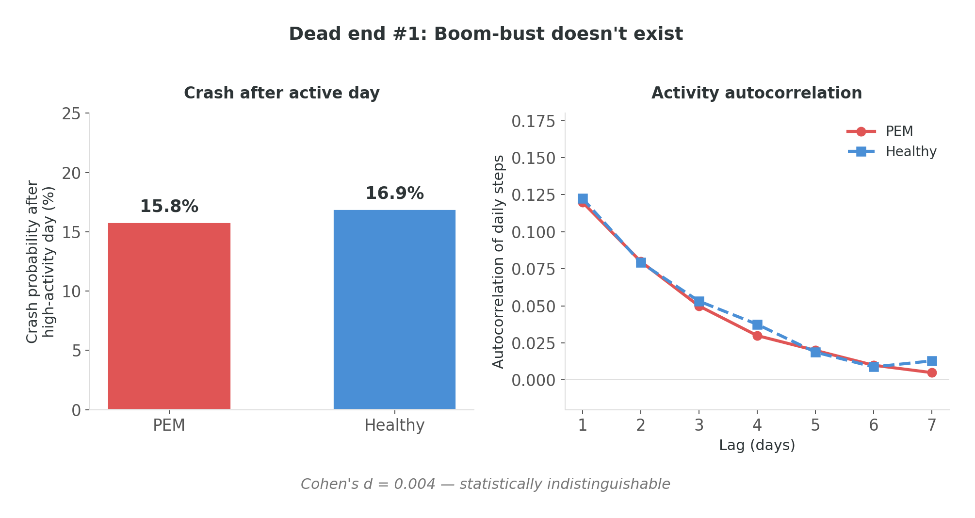
I stared at d = 0.004 for longer than was productive. Then I realized what I was looking at.
Boom-bust is a description of early-stage illness. By the time a person has been living with PEM for a year or two, they’ve already learned to pace. They don’t boom-bust anymore — they live on a carefully managed plateau. The cycle isn’t absent because I measured wrong. It’s absent because the people outsmarted it. Pacing is invisible adaptation, and by the time these people appear in a dataset, they’ve already adapted.
The lesson I took into the next stage: you are not measuring the disease. You are measuring the result of someone coping with it. If you look for the wound and the person has already grown scar tissue that looks like normal skin, you’re going to conclude there was never a wound.
Dead end #2: PEM recovers better than healthy
This was the one that almost broke me.
After the boom-bust failure, I went methodological. Matched pairs: people with self-reported PEM paired with non-PEM controls by age, sex, and activity level. Same step counts, same demographics, comparable observation windows. I compared recovery metrics — how quickly and completely heart rate returned to baseline after exertion. Textbook design. No way this fails.
The result: Cohen’s d = −0.12. Statistically significant (p = 0.001).
The PEM group recovered better.
I remember exactly where I was when I saw this. There’s a particular quality of silence in your own head when a result contradicts the reason the project exists. It wasn’t confusion — the statistics were clean. It was the moment where you ask yourself: did I get the cohort labels backwards?
I didn’t. The labels were correct. The analysis was correct. The conclusion was wrong — but not because of a bug. Because of something more fundamental.
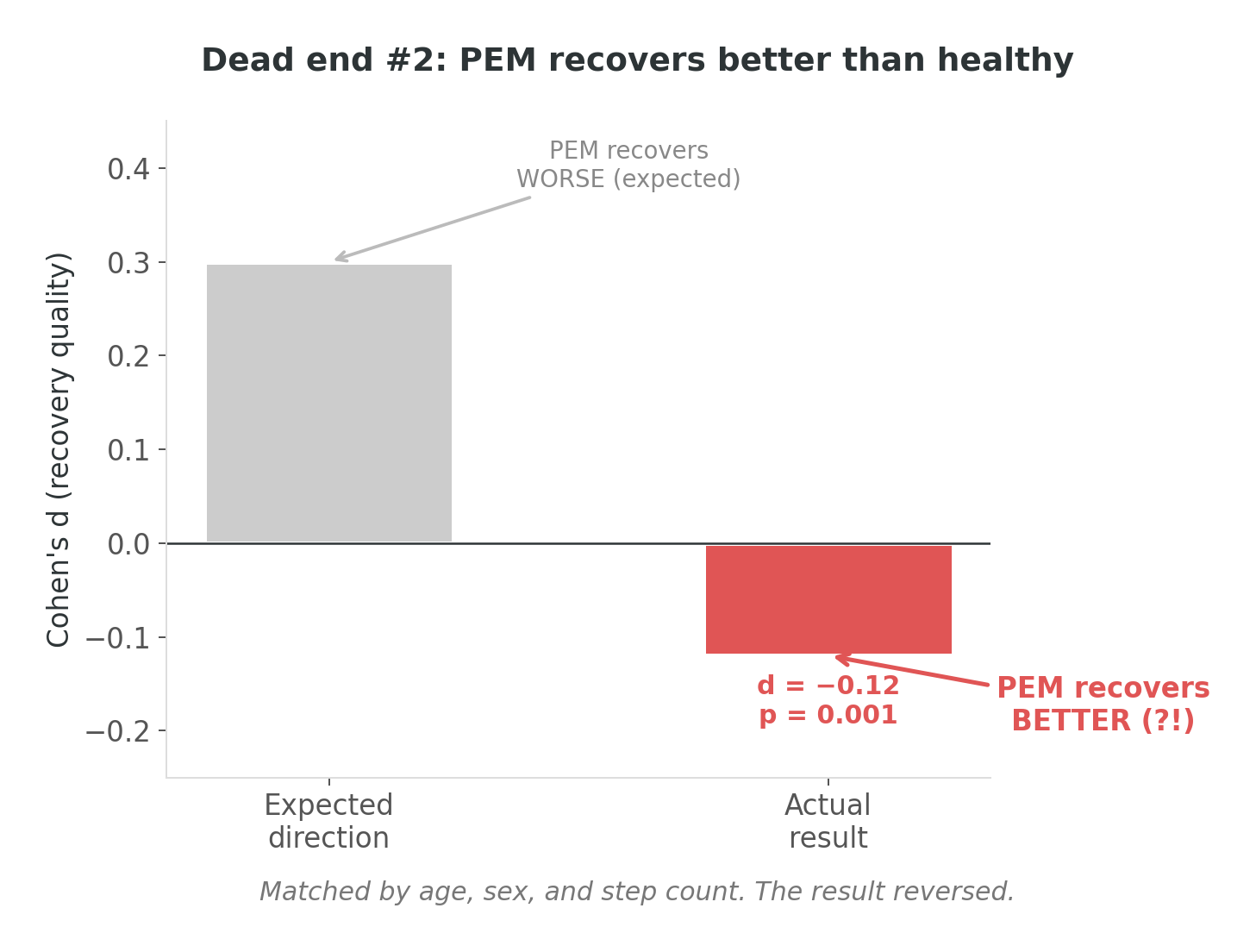
It took me a few days of staring at distributions to see it. Matching on step count controls for how much someone walks, but it doesn’t control for how they walk. A person with PEM who takes 5,000 steps does it slowly, with breaks, at low intensity. A non-PEM person who takes 5,000 steps does it at a normal clip, with bursts, at moderate intensity. Same step count — very different cardiac load.
Less cardiac load means less to recover from. Recovery looked “better” because the input was smaller. I wasn’t measuring recovery capacity. I was still measuring activity intensity, just through a more sophisticated back door.
The lesson: the data wasn’t wrong — my question was. And I think this activity confound may be under-addressed in much of the published wearable-PEM literature. If a study compares a PEM group to non-PEM controls and doesn’t control for activity intensity — not just step count, but actual cardiovascular demand — I’d want to see how their reported effect sizes hold up under stratified analysis. Most studies don’t stratify. The ones that do tend to find much smaller effects, or — like me — paradoxical ones.
Dead end #3: Surveys are noise
By this point I was running out of obvious approaches, so I tried the one that felt most scientifically virtuous: ask the people living with PEM.
For three months, 47 users completed surveys about their PEM symptoms — crash severity, symptom intensity, condition self-assessment. I matched these against physiological data from the same periods, expecting the survey to serve as ground truth. If someone says “I’m crashing,” the wearable data should show it, right?
ICC — intraclass correlation, the standard measure of agreement between two rating systems — ranged from 0.019 to 0.356 across six features. For context: below 0.4 is generally considered “poor agreement.” Below 0.2 is noise. My best feature barely cleared the noise threshold.
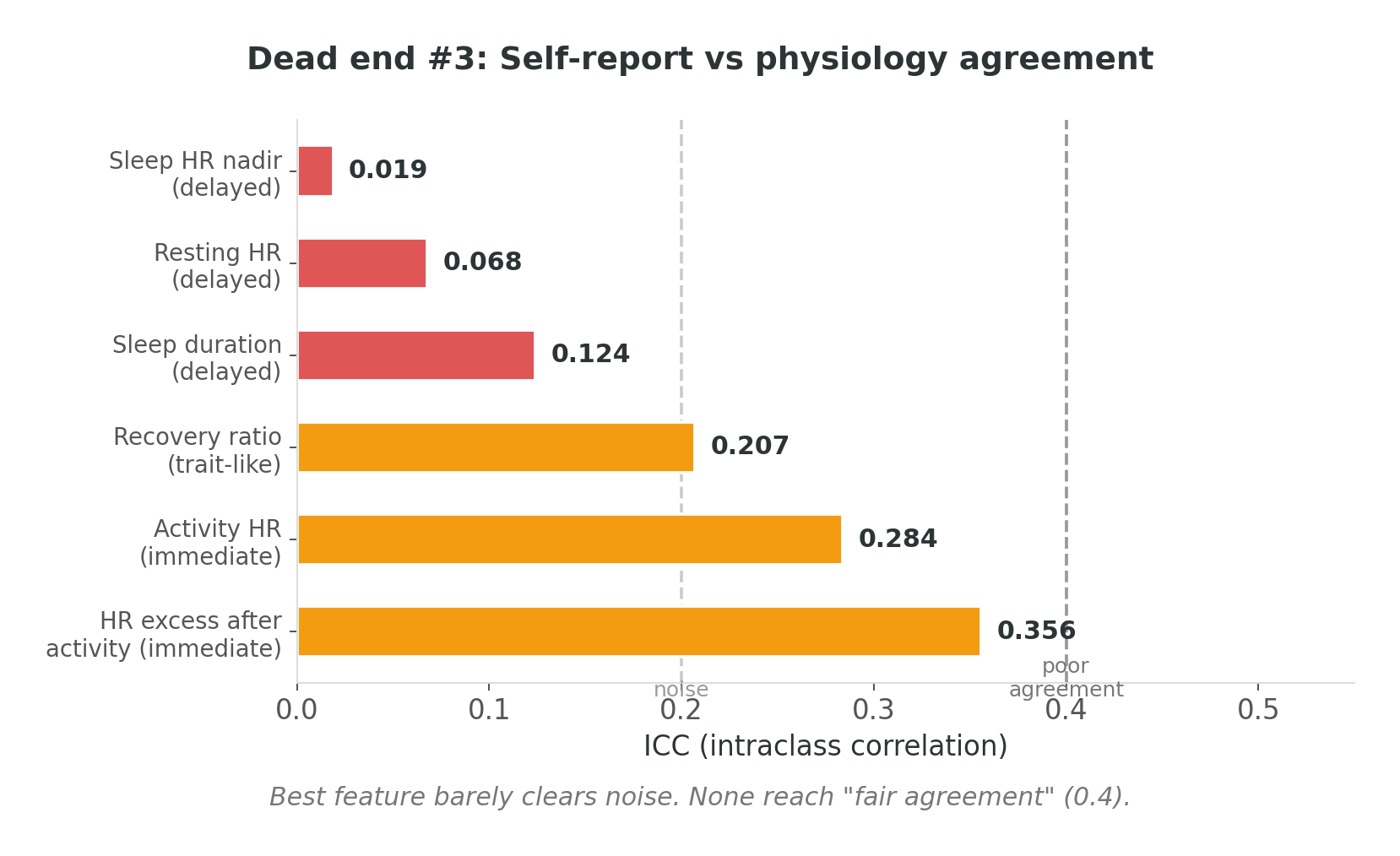
Self-report and physiology don’t agree — and this isn’t because people are bad reporters. It’s arguably the definition of PEM: the disconnect between what you did and what you feel. The bill arrives 24 to 72 hours after the spending. Self-assessment captures the arrival of the bill, not the expense that caused it. Both are real. They’re just measuring different things at different times.
Three dead ends in. I had a dataset that refused to confirm anything the literature said should be there, an effect that went the wrong direction, and surveys that agreed with physiology about as well as a coin flip. I was starting to wonder if wearable data simply couldn’t see PEM at all.
The lesson: self-report is a complement, not ground truth. If you use one time-shifted signal as the truth label for another, you get noise — not because either signal is wrong, but because they’re answering different questions about the same phenomenon. I needed a physiological ground truth that didn’t depend on the person’s perception aligning with the body’s timeline.
The pivot: not how much, but how predictably

Three dead ends, and somewhere around the third one, I did something I should have done at the start. I stopped looking for what the literature said should be there and started looking at what was actually in front of me.
Every dead end had a second message, quieter than the first. The averages didn’t separate PEM from non-PEM. Average recovery, average heart rate, average HRV — after controlling for activity, the groups looked the same. The averages were identical. But something was clearly different, because these people were living fundamentally different lives.
I can tell you the exact afternoon this clicked, because I was eating soup and it went cold while I was staring at a plot. Two time series of recovery quality, both with the same mean value — one steady, one chaotic. I had been computing means for months. I hadn’t plotted the day-to-day consistency. Nobody had, because why would you — you’re looking for a difference in levels, not a difference in stability.
But the consistency was the difference.
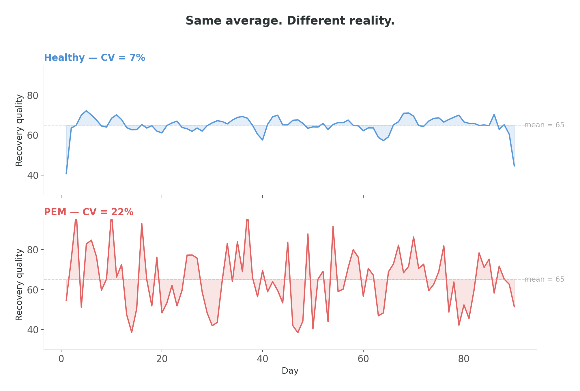
Instead of asking “how much does this person recover,” I started asking “how predictably does this person recover.” Not levels — day-to-day instability. Not averages — consistency metrics. And everything lit up.
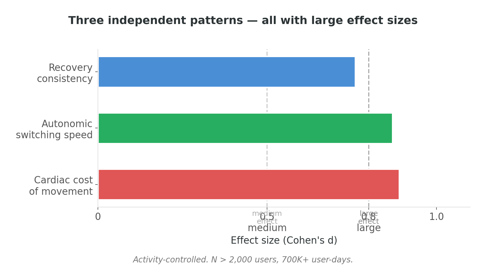
Three independent feature groups emerged, all with statistically large effect sizes — Cohen’s d above 0.7, which in behavioral research with a heterogeneous, self-reported cohort is a strong observational signal, though not the same as validated diagnostic accuracy. After months of d = ±0.1, seeing numbers in that range felt like someone turned on a light in a room I’d been stumbling through in the dark.
Recovery consistency — how predictably recovery happens from one day to the next. A non-PEM body recovers about the same way every day. A body in the self-reported PEM group shows roughly twice the day-to-day spread. Same average, substantially different predictability.
Autonomic switching speed — how quickly the nervous system shifts gears after effort. This is a well-established physiological measure of cardiovascular health (Cole et al., 1999); in the self-reported PEM group, the switch is slower. This was the most robust single pattern — it held across every activity quartile, from the most sedentary to the most active. It is not an artifact of walking less.
Cardiac cost of movement — how much cardiac work each unit of walking costs. For the same walk, a person in the self-reported PEM group’s heart works roughly 50% harder than an activity-matched non-PEM user.
A note on what this is and isn’t: the algorithm I describe here is a research artifact, not a current feature of the Welltory product. This is observational research conducted on anonymized historical data. The patterns are statistical observations in a self-reported cohort — not validated diagnostics.
Three features from three different physiological systems, all pointing the same direction. I tested a model with over twenty features against a minimal three-feature model — the three-feature model slightly outperformed the complex one. In observational research on a heterogeneous self-reported cohort, classification performance reached AUC ≈ 0.77 — meaningful for research signal-detection, but well short of what would be required for clinical use. The signal was clean enough that adding more features added noise, not information.
Forty-five thousand users later
Once the three features crystallized, I needed to know if they held outside the research cohort. I applied the algorithm retrospectively to anonymized historical data from more than 45,000 Welltory users, controlling for activity level at every step — the confound that had wrecked every earlier approach.
Three validation results stood out, and each one was a different flavor of relief.
Dose-response. I divided users into groups by self-reported crash frequency. Every single feature showed a monotonic increase across crash severity (p < 0.001). The algorithm doesn’t just find “a pattern” — it finds a pattern that grades with the severity of the self-reported experience. When I first plotted that monotonic curve after months of null results, I closed my laptop and went for a walk. Seeing a staircase going exactly where it should go was almost disorienting.
Cascade effect. A bad recovery night predicts another bad night at more than double the baseline risk. Day two: still elevated at roughly 2×. PEM isn’t a single event — it’s a self-reinforcing spiral. Many people who report PEM describe this intuitively; this observation is consistent with that lived experience.
Community cohort. With consent from participants in Welltory’s community of users with self-reported energy-limiting conditions, I applied the algorithm to their anonymized data. The community was recruited based on self-reported conditions — the algorithm played no role in participant selection. Result: more than double the expected rate of elevated-risk scores compared to the general user population baseline. A separate cohort, assembled through entirely different criteria, and the algorithm found the pattern anyway.
What I learned
Five things I’d tell the version of me who started this project.
The activity confound ruins everything. Any naive comparison between a self-reported PEM group and non-PEM users is measuring fitness, not PEM. This is uncomfortable because I think it applies to a significant portion of published wearable research on these conditions. The studies that control for it tend to find smaller effects. The ones that don’t — and there are a lot of them — may be building on a foundation that hasn’t been tested. If I were reviewing a wearable-PEM paper, the first thing I’d check is whether they stratified by activity level. If they didn’t, I’d want to see the analysis repeated with stratification before drawing conclusions from their effect sizes.
You won’t find the answer if you’re asking the wrong question — even when it’s right in front of you. I spent months computing recovery averages while the actual signal — day-to-day consistency — was sitting in the same dataset, one aggregation function away. Three dead ends weren’t three failures. They were three wrong questions that slowly taught me the right one. The boom-bust dead end taught me people had already adapted. The matched-pairs catastrophe taught me that controlling for quantity doesn’t control for intensity. The survey dead end taught me that the body’s timeline and the person’s timeline don’t align. Each wrong question eliminated a wrong assumption. In retrospect, there was no shortcut — the right question was only reachable through the wrong ones.
Consistency beats averages. This generalizes well beyond PEM. The stability of a metric is not the same as the stability of the system producing it. Two systems can output the same average and be in completely different states. The idea isn’t new in physiology — HRV itself is a variability metric — but applying it to multi-day recovery patterns was the move that unlocked this project.

Sensitivity hurts. The algorithm, at its strict threshold, misses more than half of self-reported PEM cases. We chose specificity over sensitivity — it’s better to miss someone than to falsely flag them. But it means that the absence of a signal is not a clean bill of health. It means the algorithm didn’t find enough signal in the available data. This is the trade-off nobody wants to make, and everyone has to.
The gap isn’t data — it’s the questions we ask of it. There is a population — tens of millions of people worldwide — living with the daily experience that their body is unreliable while every test comes back normal. Standard wearable analytics don’t have the right framework for them. After a year of digging through these patterns, what I keep coming back to is how close the answer was to the surface — one aggregation function away from the metrics I’d been computing for months — and how many wrong questions I had to ask before I found it. The data was always there. The right question wasn’t.
The body doesn’t lie. But you have to ask it the right question.
For a year, I asked “how much does this person recover” and got silence. When I switched to “how predictably does this person recover,” the data started talking.
A statistical signature associated with self-reported PEM in this research is not in the measurement. It’s in the measurement’s stability. Same averages, different variance. Same steps, different cardiac cost. Same recovery — on average — but one body knows what tomorrow looks like, and the other doesn’t.
I don’t know yet whether this is the final form of the algorithm or an early version of something better. The activity confound still has corners I haven’t explored. Menstrual cycle effects are almost certainly a first-class variable I’m not yet incorporating. The sensitivity ceiling bothers me. The self-reported ground truth means these are observational patterns, not validated diagnostics — replicating in clinically confirmed cohorts is the essential next step. But the three patterns — consistency, switching speed, and cardiac cost — have held up across four iterations, two research phases, and more than 45,000 users of anonymized historical data. That’s not nothing.
For people living with PEM who are reading this: this research suggests that wearable data contains patterns that warrant further investigation. The three features described here — recovery consistency, autonomic switching speed, and cardiac cost — are research signals, not diagnostic conclusions. Validating them in clinically confirmed cohorts is the next step, and I’d welcome any researcher who wants to try.
The full research findings, with methodology and visual evidence, are published as What Recovery Pattern Data Can Show About Post-Exertional Malaise on Welltory’s research page.
May 2026. Welltory Research. This is observational research; no clinical intervention was tested. Findings represent statistical patterns in aggregate data and should not be interpreted as diagnostic for any individual. Consult a qualified healthcare provider for medical concerns.
Creators of fatiguesense.com are trying to solve some problems that you describe in the article. Maybe you can collaborate?